Instagram Changed Its Logo Wordmark: Technical Analysis and Typographic Comparison

TL;DR
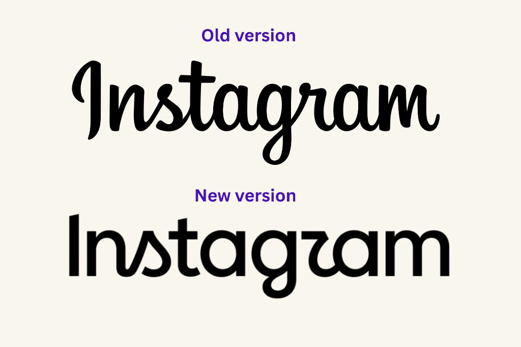
Instagram updated its wordmark for the first time in a decade, replacing the classic cursive script with a bold hybrid geometric sans. Here is the technical typography breakdown.
Table of Contents
For over a decade, the cursive Instagram script stood as one of the most recognized logotypes on the internet. Hand-drawn in 2013 by American designer Mackey Saturday, the flowing lettering defined the visual era of mobile photo sharing. In August 2026, Instagram rolled out an extensive wordmark update, replacing the calligraphic script with a bold, hybrid geometric sans-serif logo. A technical analysis of its letterform construction, stem weights, optical kerning, and screen rendering reveals the architectural drivers behind this major identity transition.
Wordmark Evolution at a Glance
Smooth, continuous baseline connections, calligraphic entry terminals, angled cursive slant, and vintage sign-painting roots. Expressive character, but suffered stroke thinning at sub-24px mobile headers.
Upright vertical stems, +18% higher x-height, uniform mono-linear stroke thickness, and squircle corner curvature, blended with stylized loop gestures on 's', 'r', and 'g'.
Prevents hairline stroke dropouts on high-DPI OLED screens, unifies wordmark geometry with the app icon squircle, and pairs cleanly with the Instagram Sans system.
1. The Legacy of the 2013 Mackey Saturday Cursive Script
When Instagram first launched in October 2010, the platform used a stock font called Billabong for its logo. While nostalgic, Billabong suffered from rough vector paths, uneven stroke modulation, and inconsistent connecting angles between glyphs. In 2013, founder Kevin Systrom commissioned typography designer Mackey Saturday to craft a custom, bespoke script wordmark.
Saturday drew inspiration from 1950s American sign painting, bowling alley neon signs, and vintage camera emblems. His hand-drawn letterforms achieved three distinct aesthetic qualities:
- Fluid Calligraphic Ligatures: The baseline strokes connected smoothly from the lowercase 'n' through 's', 't', 'a', 'g', 'r', 'a', and 'm' without visible seam points or disjointed breaks.
- Organic Slant Angle: A steady forward italic inclination of approximately 8.5 degrees provided visual momentum, suggesting spontaneous handwriting and creative expression.
- Flourished Entry Terminal on Capital 'I': The capital letter 'I' featured a curved top hook and tapering stem that established a friendly, approachable tone.
For over thirteen years, this script survived major app redesigns, including the historic May 2016 overhaul that replaced the skeuomorphic leather camera icon with the flat gradient glyph. While the app icon and interface changed, the Mackey Saturday wordmark remained the steady anchor of the brand.
Create Custom Aesthetic Typography for Your Instagram Bio
Generate stylish unicode fonts, bold script text, and minimalist characters for your profile captions.
Open Free Instagram Font Generator2. Technical Anatomy: What Changed in the New 2026 Wordmark
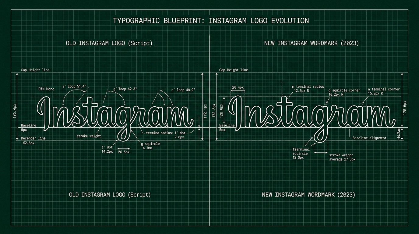
The 2026 wordmark represents an intentional shift away from pure calligraphic script into a hybrid geometric sans structure. Rather than adopting an off-the-shelf neo-grotesque font, the internal Meta design team crafted a custom set of letterforms that balance upright geometric stems with selective cursive loops.
Core Typographic Modifications
A microscopic examination of the vector paths reveals four fundamental engineering updates:
- Upright Capital 'I' with Strict Vertical Alignment: The flowing, hooked capital 'I' of the 2013 logo has been replaced by a rigid, vertical sans-serif pillar. It features zero slant angle (90 degrees perpendicular to the baseline) and square top and bottom terminals.
- Increased x-Height Ratio: The proportional height of lowercase letters relative to the capital 'I' increased by roughly 18%. A taller x-height improves letter recognition when rendered at small pixel heights in top navigation bars.
- Mono-linear Stroke Weight: The thick-to-thin contrast of the calligraphic pen nip has been normalized into a consistent, heavy vector stroke. This prevents hairline sections (such as the top arch of 'a' and connecting bridges) from vanishing when viewed on low-brightness mobile screens.
- Squircle Corner Radii: The curved apexes on letters 'n', 't', 'a', and 'm' incorporate the mathematical superellipse geometry (squircle) from the app icon, using G2 continuous curvature rather than circular arcs.
3. The Hybrid Script Gestures: Why Some Users Read "Instagzam"
The most discussed aspect of the new wordmark is its hybrid nature. While letters 'I', 'n', 't', 'a', and 'm' follow clean sans-serif geometry, letters 's', 'r', and the descender of 'g' retain stylized cursive loops.
In standard typography, mixing upright printed letterforms with connected cursive flourishes creates visual tension. In the new logo, the lowercase 'r' connects to the following 'a' via a low sweeping baseline arc, mimicking a handwritten cursive join. Because the preceding 'g' has an open descender loop, some readers visually group the 'r' loop with the 'g', leading to the viral social media observation that the logo reads phonetically as "Instagzam" or "Instagramm".
From a brand identity perspective, this tension was intentional. A purely neutral sans-serif wordmark would surrender the artistic personality of Instagram. By preserving the cursive loops on 's' and 'r', the design team retained visual rhythm while modernizing the overall typographic skeleton.
Build Symmetrical 3x3 Photo Grids and Carousels
Split high-resolution images into multi-post panoramic grids with pixel-perfect alignment.
Open Free Instagram Grid Maker4. Mobile App UI: Rendering Performance and Header Scalability
Logos on modern social media platforms live inside compact mobile application headers. On iOS and Android, the Instagram wordmark sits in the top-left corner of the feed with a constrained physical height of 28 to 32 density-independent pixels (dp).
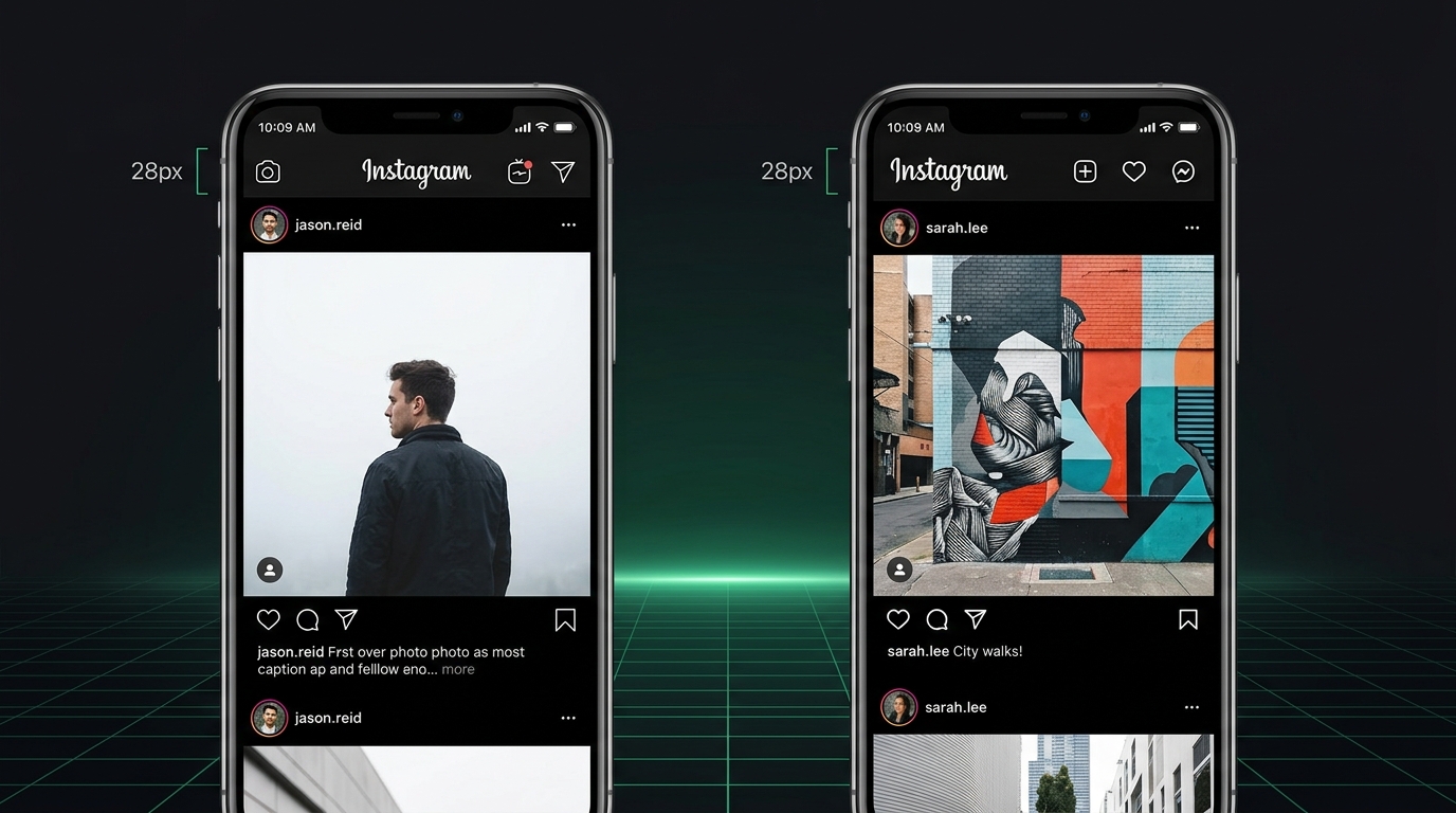
At a 28px height, the 2013 script presented several subtle UI rendering limitations:
- Sub-Pixel Antialiasing Blur: The delicate calligraphic upstrokes between letters 's', 't', and 'a' measured less than 1.2px on standard screens. Raster sub-pixel antialiasing created soft gray halos around thin strokes, reducing sharpness.
- Dark Mode Contrast Degradation: White text rendered on a pitch-black (#000000) OLED background experiences optical halation (light bleed). Thin script strokes appear thinner against dark backgrounds, whereas the thicker stem weight of the 2026 wordmark maintains solid legibility.
- Alignment with System Icons: In the top navigation bar, the wordmark sits directly adjacent to standard 24px utility icons (camera, direct messages, notifications). The vertical sans-serif structure of the new logo aligns naturally with the geometric bounding boxes of neighboring icons.
5. Detailed Technical Comparison: 2013 Script vs 2026 Hybrid Wordmark
| Typographic Metric | 2013 Script Logo (Mackey Saturday) | 2026 Hybrid Wordmark | Technical Significance |
|---|---|---|---|
| Classification | Custom Connected Cursive Script | Hybrid Geometric Sans-Serif | Shifts from retro sign-painting to digital-native identity |
| Capital 'I' Anatomy | Flourished hook with cursive entry | Straight vertical stem (90° upright) | Establishes a firm left baseline margin |
| x-Height Ratio | 57% of cap-height | 75% of cap-height | +18% increase improves small-screen readability |
| Stroke Modulation | Variable thick-to-thin calligraphic ratio | Uniform mono-linear thickness | Prevents optical dropouts on OLED displays |
| Curvature Model | Traditional circular Bezier curves | G2 Continuous Squircle Superellipse | Direct geometric harmony with app icon curves |
| Kerning Rhythm | Continuous ligature connections | Discrete glyph spacing with loop bridges | Improves OCR parsing and automated screen-readers |
Frequently Asked Questions
When did Instagram change its wordmark logo?
Instagram updated its primary text wordmark in August 2026. This marks the first structural change to the brand's logotype lettering since the 2013 Mackey Saturday redesign.
Who designed the original 2013 cursive script logo?
The 2013 cursive script was custom-designed by Mackey Saturday, an American typography designer and brand identity specialist. His hand-drawn lettering replaced the original unrefined Billabong font and served as Instagram's wordmark for thirteen years.
Why does the new Instagram logo look like it says "Instagzam"?
The perception stems from the hybrid combination of upright sans-serif letters with cursive script loops on letters 's', 'r', and 'g'. The low baseline curve connecting 'r' to 'a', combined with the loop on 's', creates a visual gesture that some viewers interpret as the letter 'z'.
Is the new wordmark available as a downloadable font?
No. The Instagram wordmark is custom-engineered vector lettering created exclusively for the brand logotype. However, it shares design DNA with the broader Instagram Sans typeface family developed by Meta and Colophon Foundry for app headings and UI elements.
How does the new logo improve mobile accessibility?
The 18% higher x-height and uniform stroke weight provide higher contrast against dark mode backgrounds, preventing fine calligraphic lines from blurring or disappearing on small smartphone headers.

Written by Ayesha Hussain
Editor and Research Lead · Cubbbix
Ayesha Hussain researches product design, vector graphics architecture, and interface usability standards. Her technical analyses explain how digital platforms build responsive brand systems for global audiences.


Was this article helpful?
Comments
Loading comments...